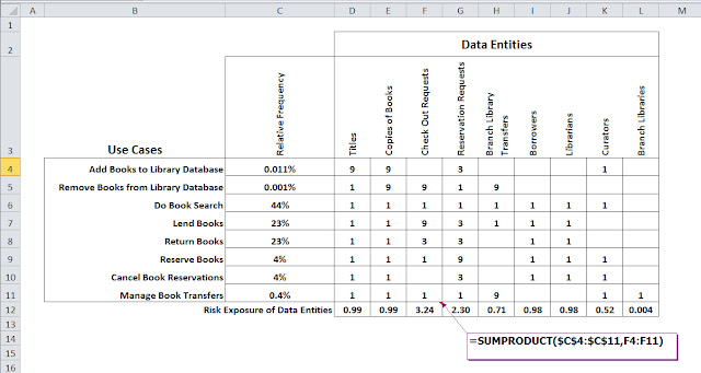
 In the last post I talked about how to apply the concept of risk exposure to the data of your system or application. The risk exposure of an event is the likelihood that the event will
actually happen, multiplied by the expected severity of the event. Each time your customer runs a use
case, there is some chance that they will encounter a defect in the
product. For use cases, failure is the "event" whose risk exposure we'd like to know. What you’d like to have is a way to compare the risk exposure from use case to use case so
you can work smarter, planning to spend time making those use cases with the highest risk exposure more reliable.
 In my book, Use Case Levels of Test, I look at an an extension of the product's operational profile to provide a quantitative way to compare risk exposure across all the use cases of a use case diagram. But in this post we'll look at a quick and easy way to do this that works great for example in test team planning workshops using the white board.
The Boston Matrix
The Boston Matrix is said to have been created by the Boston Consulting Group (hence the name) as a tool for product portfolio analysis. It was originally presented as a way to categorize a company's product portfolio into four quadrants based on two scales: current market share and potential future market growth. The idea is to identify your product "stars" (large market share with potential for even more growth), "dogs" (low market share, not much potential for growth), etc. It's a way to triage a product portfolio for future development (spend less on dogs, more on stars).But the Boston Matrix is a great tool for quickly categorizing any set of things. Below is a Boston Matrix set up for triaging use cases based on their risk exposure, with the horizontal axis representing how frequently you expect a use case to be used, and the vertical axis representing the severity of failures in a use case.
The idea is to assign each use case for which you need to design tests into one of four quadrants. The upper right quadrant represents those use
cases that are both frequently used, with high severity failure and hence have the biggest bang for the buck in terms of making sure they are thoroughly tested and reliable. Conversely the lower left quadrant represents use cases that are infrequently used, and if they fail, the severity is low. When test design time is at a premium these use cases are the ones to test lighter.
As I noted above, this is a great tool for test team planning workshops. As with any workshop, an important part of working through assigning use cases to each quadrant will be the “Ah, Ha!” moments that occur. As a test designer, be prepared to capture ideas, issues, assumptions, notes and questions that will inevitably arise.
In the next post we'll work through an example, evaluating the risk exposure of the use cases for a new public
library book management system.


